[wpseo_breadcrumb]

English Art News

  • The Newport Street Gallery

    Yesterday morning I made my first visit to the Newport Street Gallery – Damien Hirst’s new home for his extensive art collection. It’s a great space for art. The architects have converted three cathedral like Victorian scenery painting workshops, in places 15 metres high.
    The first exhibition is of John Hoyland’s wonderful abstract paintings from 1964 – 82. The white airy rooms display perfectly the effervescent colours of Hoyland’s huge canvases. An inspiring morning!

    IMG_0535 IMG_0534 IMG_0532

  • Landmark Art Fair update

    The Landmark Art Fair was well attended in spite of road closures due to Rugby and happily two of my paintings are now off to new homes – ‘Morning Mist, Ham Riverside and ‘January Rain, Richmond Riverside.

    Morning Mist, Ham Riverside

    January Rain, Richmond Riverside

    LandmarkArtFair2015v1 LandmarkArtFair2015v2

  • Warhol and the World of Pop

    I’d never thought of Woking as a place to visit for culture and enjoyment until discovering The Lightbox Art Gallery. There’s a great exhibition on there at the moment ‘Warhol and the World of Pop’. It features the iconic Marilyn picture, but also a collection of Warhols textile designs done in the late 1950’s – very interesting to see when he first started using repeating patterns. There’s work from European and American artists of the period and a selection of painting, sculpture, furniture, memorabilia and iconic posters. Good coffee too!!

    IMG_0475 IMG_0471 IMG_0472 IMG_0474

  • Two Tate Exhibitions

    I’ve been to two very different exhibitions recently – Agnes Martin at Tate Modern and Barbara Hepworth at Tate Britain.
    I didn’t know Agnes Martins work before seeing this exhibition and really enjoyed it – tranquil, ghostly, intricate, intense and preoccupied…..beautiful.
    By contrast Barbara Hepworths work with it’s earth colours and tactile materials is well known to me, but it was good to see work of her contemporaries (also practicing “direct carving”) alongside hers. I particularly enjoyed seeing her drawings which I hadn’t seen before and the film of her in action on a very large piece of stone.
    Lunch in the members room at Tate B was also good!!

    AgnesMartinUntitled#5Untitled #5,  Agnes Martin

    B HepworthScalpelScalpel, Barbara Hepworth

    Members room Tate BMembers room, Tate Britain


  • New Mexico Inspiration part 2

    Now Santa Fe has more than 250 fine-art galleries and is the third largest art market in the USA after New York and Los Angeles. This lovely town however maintains a strong connection to it’s cultural past. Just one example is the use of the Zia Indians sun symbol on the flag of New Mexico. This symbol, a red circle with groups of rays pointing in four directions, is regarded as sacred to the Zia Indians and embodies:-

    •    the four points of the compass (north, south, east, and west);
    •    the four seasons of the year (spring, summer, autumn and winter);
    •    the four periods of each day (morning, noon, evening and night);
    •    the four seasons of life (childhood, youth, middle years and old age); and
    •    the four sacred obligations one must develop (a strong body, a clear mind, a pure spirit, and a devotion to the welfare of others), according to the Zia’s belief.

    Zia Symbol

    Another indication of the New Mexicans respect for their cultural heritage is in the architecture of the New Mexico Museum of Art in the centre of Santa Fe. It was built in 1917 and is a wonderful example of the Pueblo Revival style architecture.

    New Mexico Museum of Art

  • New Mexico Inspiration

    After a recent visit to Santa Fe and the surrounding area, I can understand why so many artists have found inspiration in the landscape and history of New Mexico. The starkly beautiful landscape, distinct indigenous art, and unique regional style of adobe architecture are captivating.

    First image: the landscape near Abiquiu –

    Georgia O’Keeffe is well known for spending a large part of her life in a small place called Abiquiu near Santa Fe and Richard Diebenkorn lived and worked in Albuquerque from 1950-52, but I was surprised to learn that the area also attracted Abstract Expressionists such as Mark Rothko, Ad Reinhardt, Clyfford Still and Morris Graves. I was interested to learn that the influx of dozens of artists by the 1950s had established Taos as one of the centers of modernist artistic activity in the United States.

    Second image: Richard Diebenkorn – an example of his work while he lived in Albuquerque –

    Abiquiu NM 01

    R Diebenkorn Abstract


  • Trees of Richmond Park

    I’ll be exhibiting with Kingston and Surrey Artists Open Studios in June this year and sharing a studio with other artists which is based just beside Richmond Park. It seemed like a good plan to base a body of work on a feature of the park and apply my learning from the course that I did earlier in the year at The Slade.

    I love the trees in winter when you can clearly see the structure of the branches. I also really like to see the ancient trees in the park, which are left to slowly break down and in the process provide food and housing for various insects.

    I decided to do a series of small scenes of the park trees and some larger colourful abstracts based on the ancient fallen trees with their wonderful roots. Here are the first three……

    IMG_1189crop IMG_1188crop IMG_1186crop

  • Colour Theory continued

    March 2nd

    My colour theory course continues. This weeks session moved away from selecting colour through observation and into experimenting with ways of generating colour systems. The idea was to provide us with ways to open up new ideas for using colour within our own work.

    We were asked to mix three colours that we liked and using them, paint a simple cube on 6 or 7 different coloured pieces of paper. We then had to choose which one we liked most, which gave us 4 colours to work with. The subject to be painted was a white teapot. The colour had to replace the areas of tone observed in the teapot.

    The results were very interesting. Lots of food for thought and experimentation here!

    RandomColourChoice

  • Colour Theory

    I decided to start the year with a short refresher course in the craft of painting. The one I chose is at the Slade and built around the colour theory of Josef Albers ‘Interaction of Colour’.

    Each exercise involves using a warm and cool version of the three primary colours with a hint of white where needed. There’s something very satisfying about painting these simple still life set ups using just three colours.

    The first image shows a piece of scrunched up grey paper on a strong colour background – it’s just about mixing greys. Very good practice!

    GreyPaperIMG_1114Apples&EasyPeelers

  • Sigmar Polke, Tate Modern January 2015

    I knew nothing about Sigmar Polke when the Tate announced this huge retrospective, so I thought I should go to see what I imagined, must be an important artist to warrant this sprawling show.

    I found myself wandering through these rooms feeling quite bewildered, puzzled really as to why he is so highly regarded.  Polke’s work comes across to me as a though he had more ideas than he could find time to follow through to finished pieces. Most of it looked half thought through and unfinished. I accept that many artists have many different strands to their work and am a huge admirer of Gerhard Richter’s work for example. Interestingly Richter and Polke studied alongside one another in Düsseldorf, but I would say Richter’s work is vastly superior.

    I wondered if I was missing something and so looked at a few reviews:

    Adrian Searle writes in the Guardian: “Tate Modern’s retrospective takes up 14 rooms. And it’s barely enough to contain the messy, druggy, unfathomably elusive and wondrous art of Sigmar Polke.”

    Richard Dorment writes in the Telegraph: “If Polke’s art feels messy and opened-ended it is because he aimed to do nothing less than to embrace the whole of human experience, from sex and drugs to art, science, mysticism, history and current events.”
    But he goes on to say: “When the viewer doesn’t have a handle on the moral or cultural context that made the image important to him, we switch off. In the end, it’s best not to over think this work and just enjoy the show as giant, constantly shifting kaleidoscope of photos, films and paintings, very much in the spirit of the 1960s.”

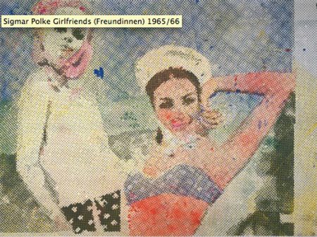
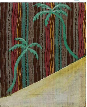
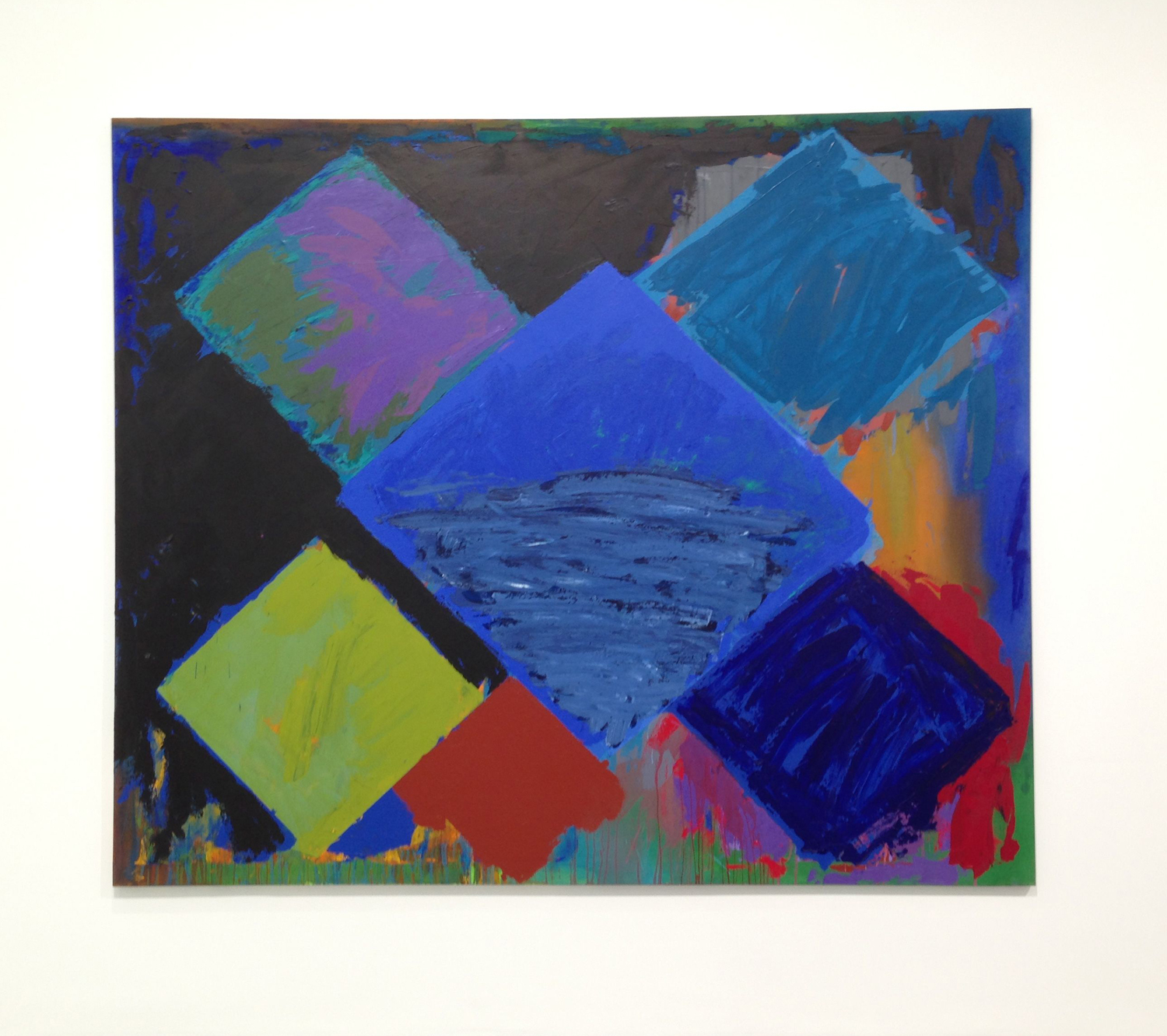
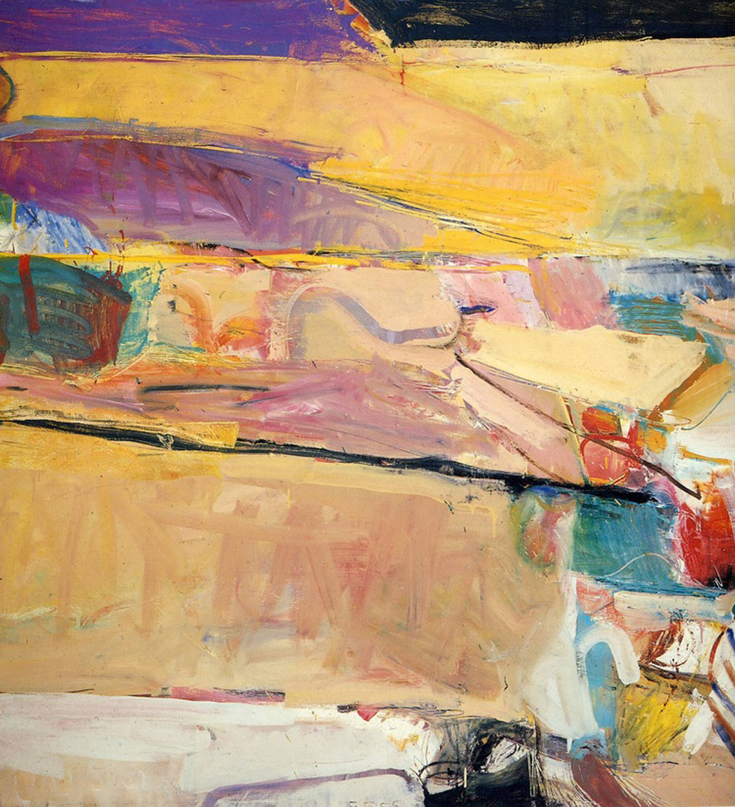
    Hmm, well in the true spirit of the sixties maybe it would be more enjoyable with help from psychedelic drugs. I wasn’t impressed. Here are a couple of examples of diverse styles….

    Sigmar Polke 01 Sigmar Polke 02